文章目录
- 1 小程序中组件的分类
- 2 常用的视图容器类组件
- 2.1 view 组件的基本使用
- 2.2 scroll-view 组件的基本使用
- 2.3 swiper 和 swiper-item 组件的基本使用
- 2 常用的基础内容组件
- 2.1 text 组件的基本使用
- 2.2 rich-text 组件的基本使用
- 3 其它常用组件
- 3.1 button 按钮的基本使用
- 3.2 image 组件的基本使用
- 3.2.1 image 组件的 mode 属性
1 小程序中组件的分类
小程序中的组件也是由宿主环境提供的,开发者可以基于组件快速搭建出漂亮的页面结构。
官方把小程的组件分为了 9 大类,分别是:
- 视图容器
- 基础内容
- 表单组件
- 导航组件
- 媒体组件
- map 地图组件
- canvas 画布组件
- 开放能力
- 无障碍访问
2 常用的视图容器类组件
-
view
普通视图区域 类似于 HTML 中的 div,是一个块级元素 常用来实现页面的布局效果 -
scroll-view
可滚动的视图区域 常用来实现滚动列表效果 -
swiper 和 swiper-item
轮播图容器组件 和 轮播图 item 组件
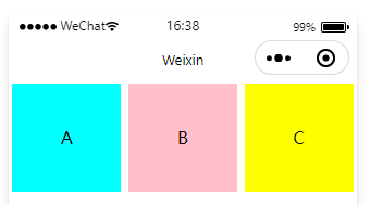
2.1 view 组件的基本使用
实现 flex 横向布局效果:
<!--pages/list/list.wxml-->
<view class="container">
  <view>A</view>
  <view>B</view>
  <view>C</view>
</view>
/* pages/list/list.wxss */
.container view {
  width: 100px;
  height: 100px;
  text-align: center;
  line-height: 100px;
}

.container view:nth-child(1) {
  background-color: aqua;
}
.container view:nth-child(2) {
  background-color: pink;
}
.container view:nth-child(3) {
  background-color: yellow;
}

.container {
  display: flex;
  justify-content: space-around;
}
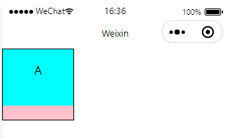
2.2 scroll-view 组件的基本使用
实现如图的纵向滚动效果:
<!--pages/list/list.wxml-->
<scroll-view class="container" scroll-y>
  <view>A</view>
  <view>B</view>
  <view>C</view>
</scroll-view>
/* pages/list/list.wxss */
.container view {
  width: 100px;
  height: 100px;
  text-align: center;
  line-height: 100px;
}

.container view:nth-child(1) {
  background-color: aqua;
}
.container view:nth-child(2) {
  background-color: pink;
}
.container view:nth-child(3) {
  background-color: yellow;
}

.container {
  border: solid 1px black;
  width: 100px;
  height: 100px;
}
2.3 swiper 和 swiper-item 组件的基本使用
开发者文档
<!--pages/list/list.wxml-->
<!-- indicator-dots 显示面板指示点 -->
<!-- autoplay 自动播放 -->
<swiper class="container" indicator-dots autoplay>
  <swiper-item>
    <view class="item">A</view>
  </swiper-item>
  <swiper-item>
    <view class="item">B</view>
  </swiper-item>
  <swiper-item>
    <view class="item">C</view>
  </swiper-item>
</swiper>
swiper {
  height: 150px;
}

 .item {
  height: 100%;
  line-height: 150px;
  text-align: center;
}

swiper-item:nth-child(1) .item {
  background-color: blue;
}
swiper-item:nth-child(2) .item {
  background-color: pink;
}
swiper-item:nth-child(3) .item {
  background-color: red;
}
swiper 组件的常用属性:

2 常用的基础内容组件
-
text
文本组件 类似于 HTML 中的 span 标签,是一个行内元素 -
rich-text
富文本组件
支持把 HTML 字符串渲染为 WXML 结构
2.1 text 组件的基本使用
通过 text 组件的 selectable 属性,实现长按选中文本内容的效果:
| selectable | boolean | false | 否 | 文本是否可选 (已废弃) | 1.1.0 |
| user-select | boolean | false | 否 | 文本是否可选,该属性会使文本节点显示为 inline-block | 2.12.1 |
开发者文档
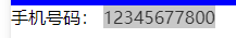
<view>
  手机号码:
  <text user-select>12345677800</text>
</view>
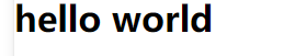
2.2 rich-text 组件的基本使用
通过 rich-text 组件的 nodes 属性节点,把 HTML 字符串渲染为对应的 UI 结构:
| 属性 | 类型 | 默认值 | 必填 | 说明 | 最低版本 |
|---|---|---|---|---|---|
| nodes | array/string | [] | 否 | 节点列表/HTML String | 1.4.0 |
<rich-text nodes="<h1>hello world</h1>"></rich-text>
3 其它常用组件
-
button
按钮组件 功能比 HTML 中的 button 按钮丰富 通过 open-type 属性可以调用微信提供的各种功能(客服、转发、获取用户授权、获取用户信息等) -
image
图片组件 image 组件默认宽度约 300px、高度约 240px -
navigator
页面导航组件
类似于 HTML 中的 a 链接
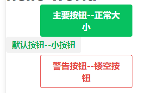
3.1 button 按钮的基本使用
开发者文档
<button type="primary" >主要按钮--正常大小</button>
<button type="default" size="mini">默认按钮--小按钮</button>
<button type="warn" plain>警告按钮--镂空按钮</button>
3.2 image 组件的基本使用
3.2.1 image 组件的 mode 属性
开发者文档
image 组件的 mode 属性用来指定图片的裁剪和缩放模式,常用的 mode 属性值如下:

<image src="https://picb1.photophoto.cn/39/864/39864381_1.jpg" heightFix></image>